From the bold contrasts of the early 20th century to fresh, contemporary combinations, color mixes are emblematic of Cartier’s style.
Cartier’s attraction to color is inherent to its vocation of jeweler. Beyond the criteria for purity, each stone is also selected for its brilliance, the intensity of its hue, the appeal of its nuances... Like a painter, the Maison composes its own palette, which has steadily grown over the decades.
Enameled objects, the first distinctively Cartier palette
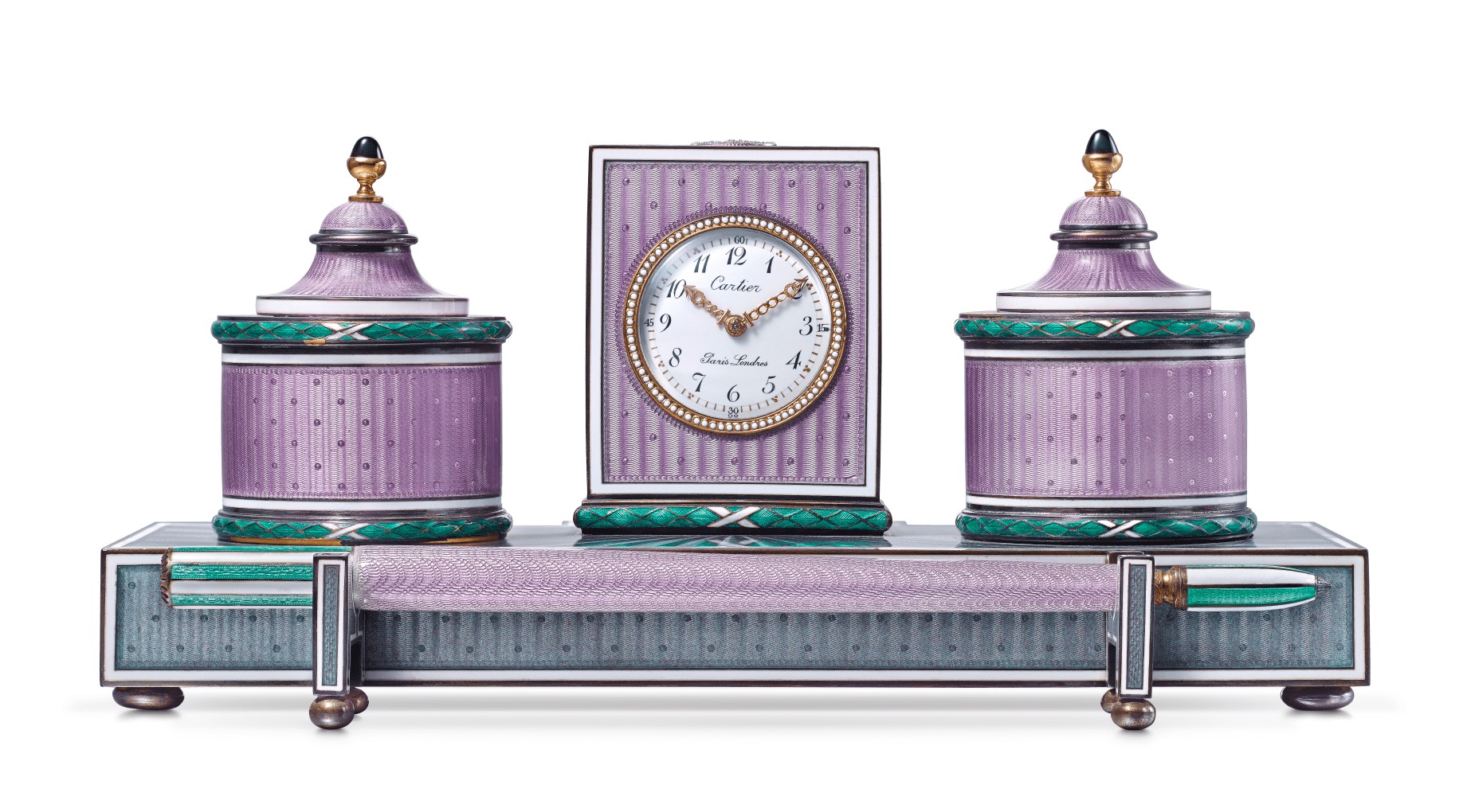
At the turn of the 20th century, Cartier created many Russian-style accessories and objects, using a technique passed down from the 18th century – guilloché enamel. It consists in applying several layers of enamel over a guilloché engraved gold or silver base, until the desired intensity of colour is obtained. The engraved motifs appear through the translucent coating, and the enamel creates an iridescent effect.
Although it was Fabergé who revived the technique, Cartier’s creations stand apart for their unique colors. Rather than borrow from the Russian jeweler’s vivid palette, the Maison chose softer tones. Its creations featured novel color associations such as mauve and green or a first pairing of green and blue, already a testimony to Louis Cartier’s taste for experimenting with color.
Early experiments and the emergence of Cartier contrasts
An aesthete and a collector, Louis Cartier quickly encouraged the Maison’s designers to take risks with color associations, as seen in their sketchbooks from the very first years of the 20th century.
Additional encouragement for these early experiments came from the changes that were then sweeping across the art world. The flat, bright colors of the Fauve artists startled visitors at the Salon d’Automne in 1905, while the Ballets Russes triumphed on stage in Paris in 1909 and throughout the entire decade that followed. Like many spectators, the art critic Joséphin Péladan was fascinated by the colorful new aesthetic of oriental inspiration, and described the shock of his discovery: “In the ballet Shéhérazade, there was not a single white space in the set or the costumes. Everything was green, blue, red, and orangey; it was instinctive and sensual. Mr Bakst works with colour qualities in a surprising fashion. One is even astounded that he obtains these true harmonies with such a loud palette.” Inspired by these fireworks of color on stage, Cartier explored a multitude of new associations in jewelry in the years that followed, not hesitating to break with some traditional codes.
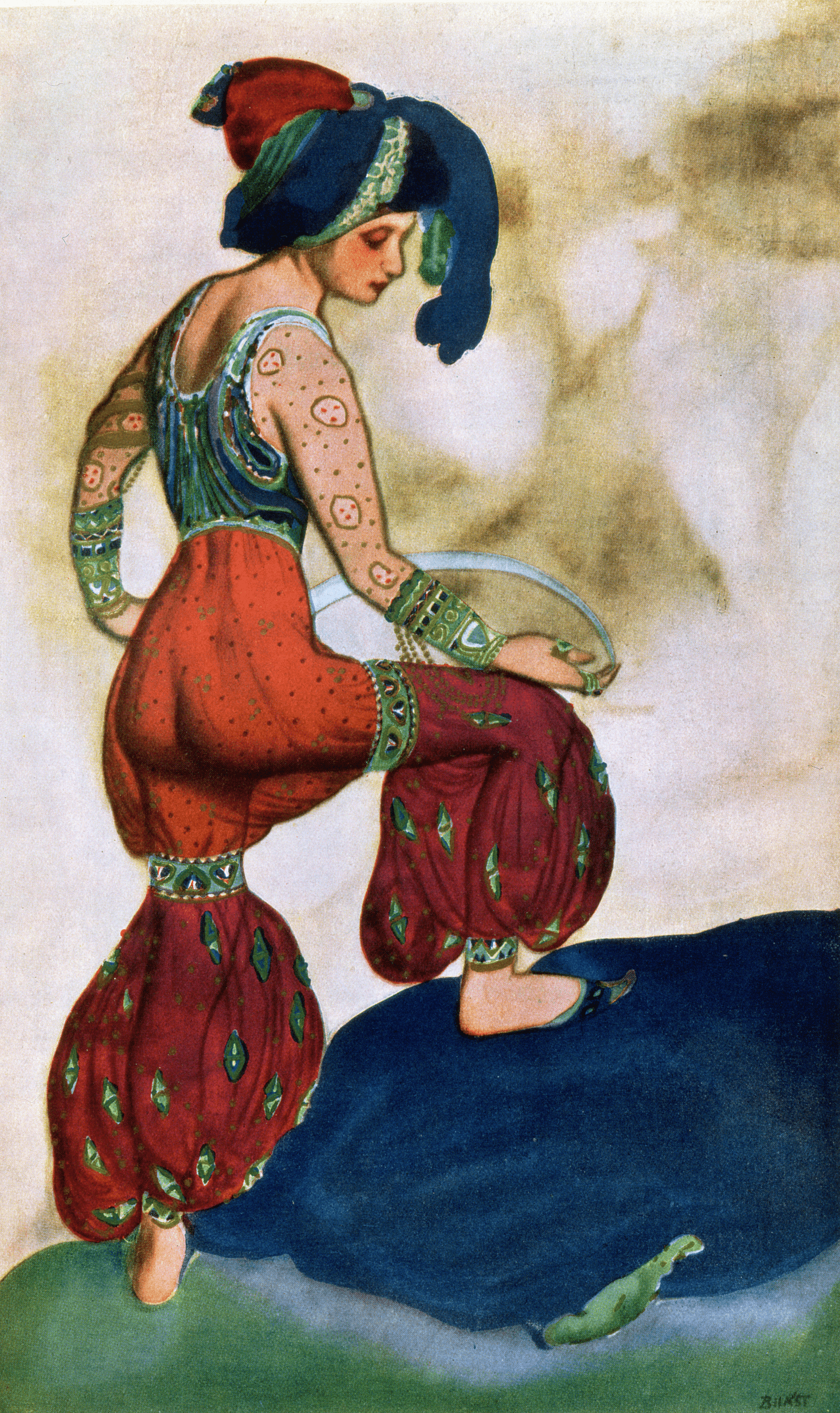
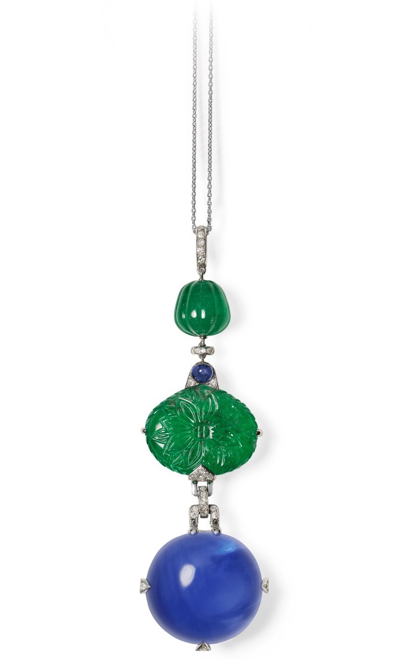
Among the most emblematic and daring combinations was the pairing of blue and green. Though nearly absent in the Western world, the combination is common in the Islamic arts, of which Louis Cartier was a collector. In particular, Ottoman ceramics from the 16th and 17th centuries mingled cobalt blue, turquoise and olive green. Although the color contrast was then considered jarring in Europe, the Maison created pieces combining sapphire and jade or emerald as of the 1910s. Nicknamed the “peacock pattern” by Louis Cartier, the palette was an immense success and gradually became a classic for the Maison and, more broadly, in jewelry.
Like blue and green, the Maison’s colour contrasts have often been influenced by foreign civilizations. Inspiration for the red and green combination came from Indian ceremonial jewelry of the Mughal period, which Jacques Cartier discovered during his first trip, in 1911, to meet the maharajas.
Recreating the contrast in its own palette, Cartier most often replaced the ruby with the warm nuance of coral, an unusual choice at the time, which the jeweler added to the compositions in lights touches. Baron de Meyer, a correspondent for Harper’s Bazaar, highlighted this bold mix in a 1926 article on the International Exhibition of Decorative Arts held in 1925: “Very original is the combination of coral, sculpted using an ancient technique, and large uncut emeralds, along with diamonds and onyx. This color harmony is another innovation by Cartier, whose popularity is growing. However, the mix is a very daring one and should be used in moderation.”
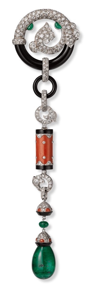
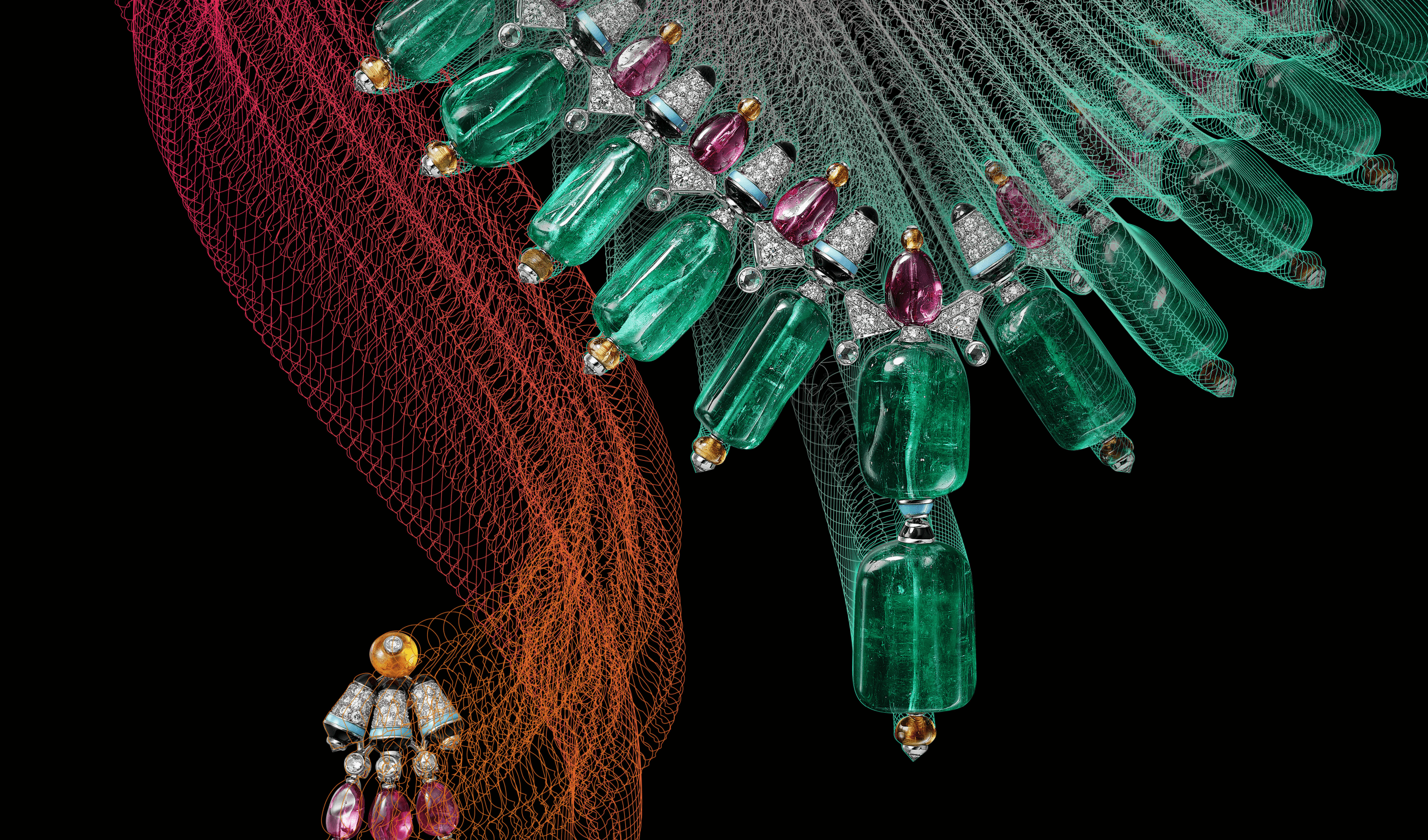
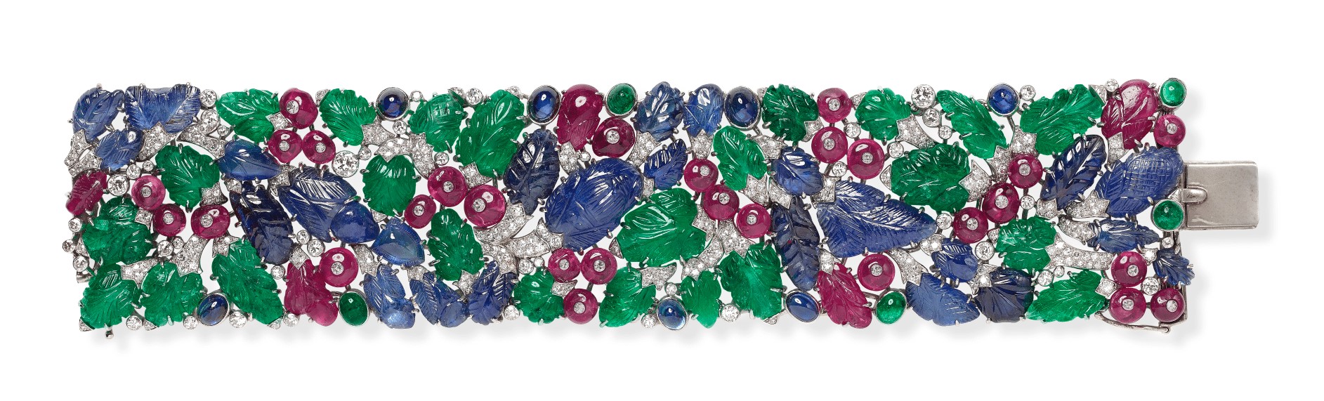
The Maison invented anew by adding the intense hue of sapphires to the combination of carved rubies and emeralds, sourced from India. Blue was rarely seen in that part of the world, where it carried some negative connotations. Probably emboldened by the aesthetics of the Ballets Russes, this audacious three-colour mix – called Tutti Frutti from around 1970 – grew more visible in the 1920s and quickly became an emblem of Cartier.
Black as punctuation
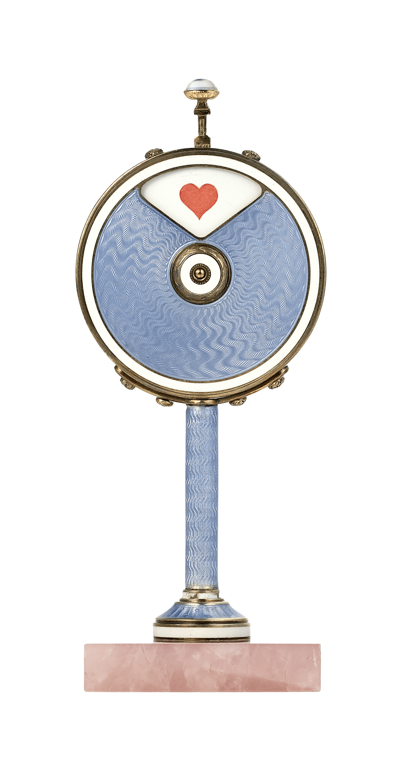
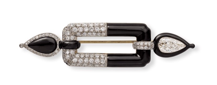
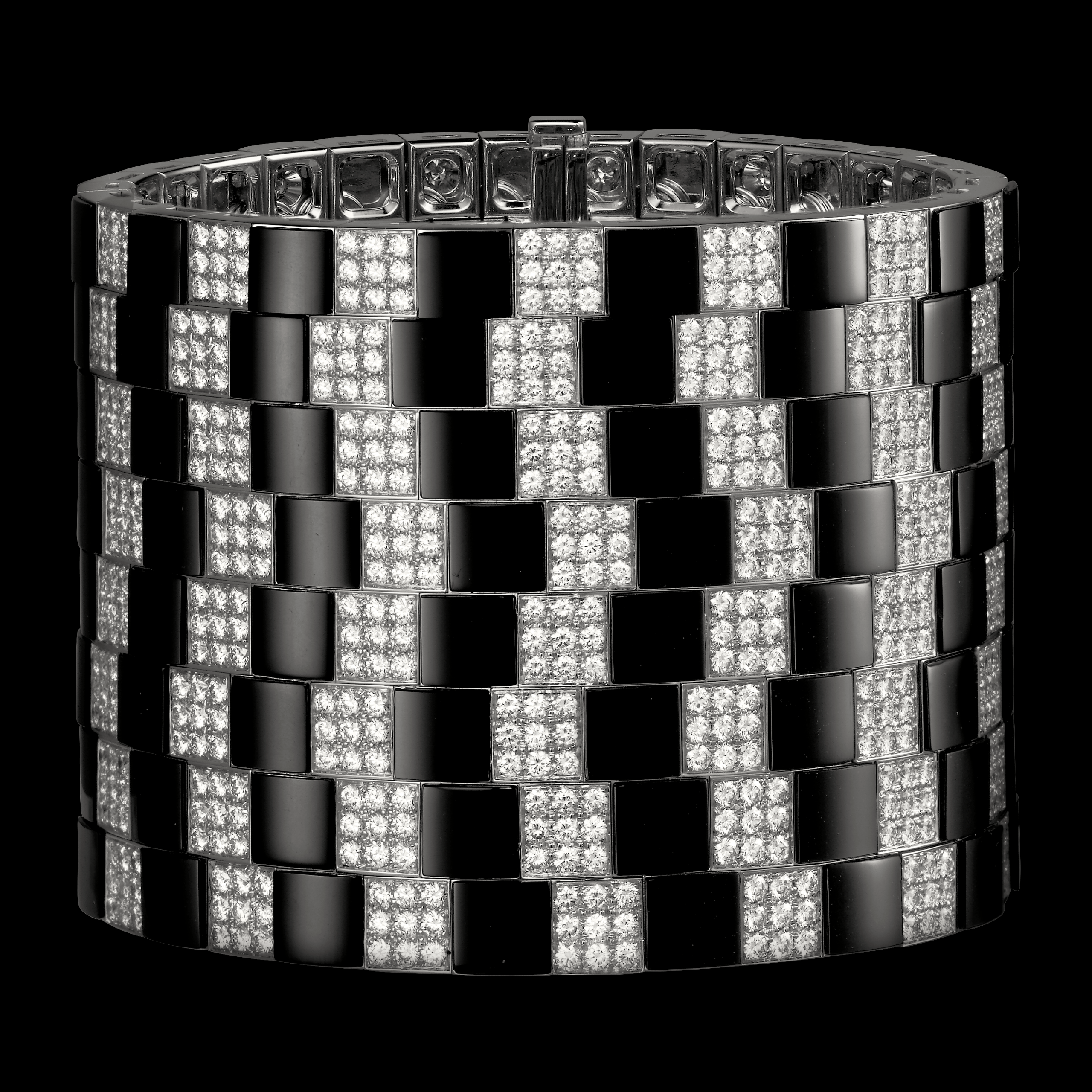
Cartier gave the colour black a key role starting as of the 1910s, mingling it with the radiance of diamonds. This more traditional pairing in jewelry experienced a new vogue and was used in mourning pieces after the sinking of the Titanic in 1912. The Maison fully grasped the modern, graphic potential of black, which it introduced with lacquer, enamel and onyx, a material whose use was also pioneered by the jeweler. The thin, dark, strokes served to accentuate geometric shapes in abstract creations heralding the Art Deco period.
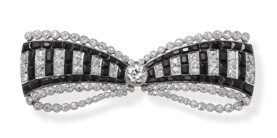
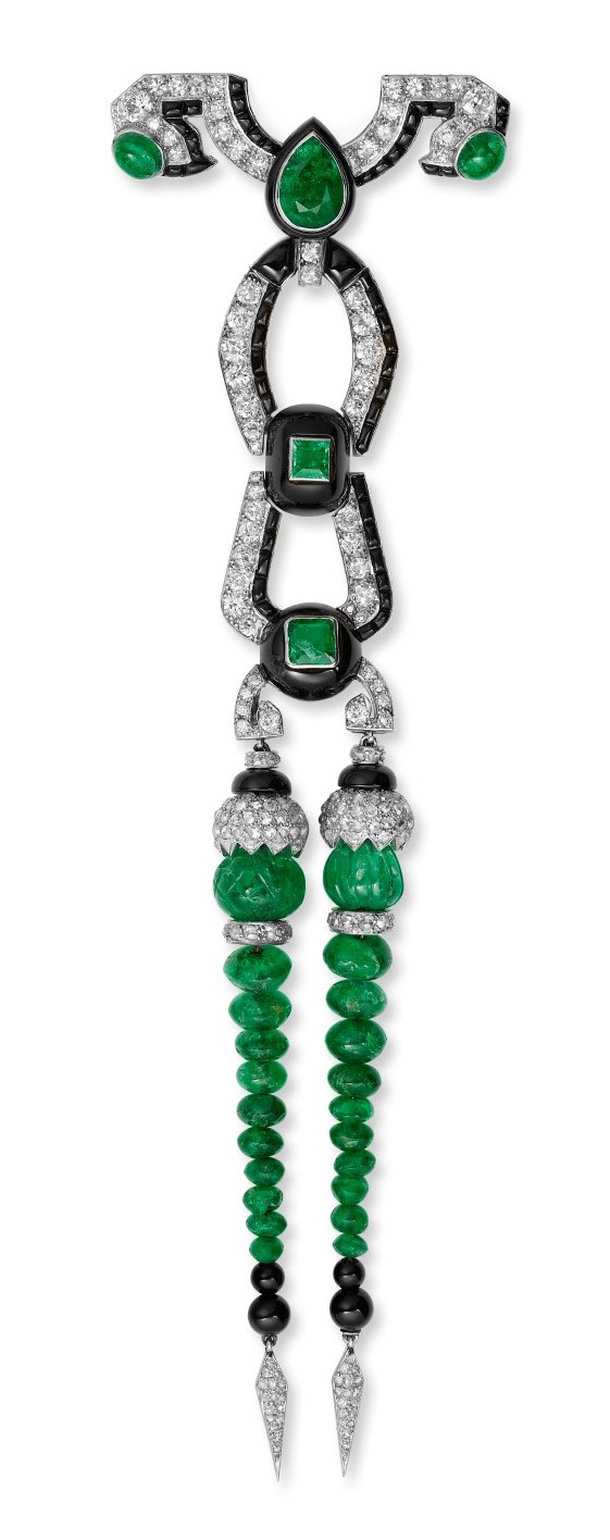
Exploring its effects further, Cartier combined black with red, green, and even both colors together. The first contrast is a striking one: the two hues stimulate each other and the warm tone of coral takes on unexpected depth. The effect of the second combination is highly graphic. A vivid green, often the intense hue of the emerald, is set off by onyx or lacquer, creating a sense of perspective or depth to the point of optical illusion and trompe l’oeil. One of the most remarkable examples from the period is a 1922 brooch in which calibrated onyx stones form a projected shadow, accentuating both the exquisite execution and the descending dynamic of the piece.
A NEW TASTE FOR STONES
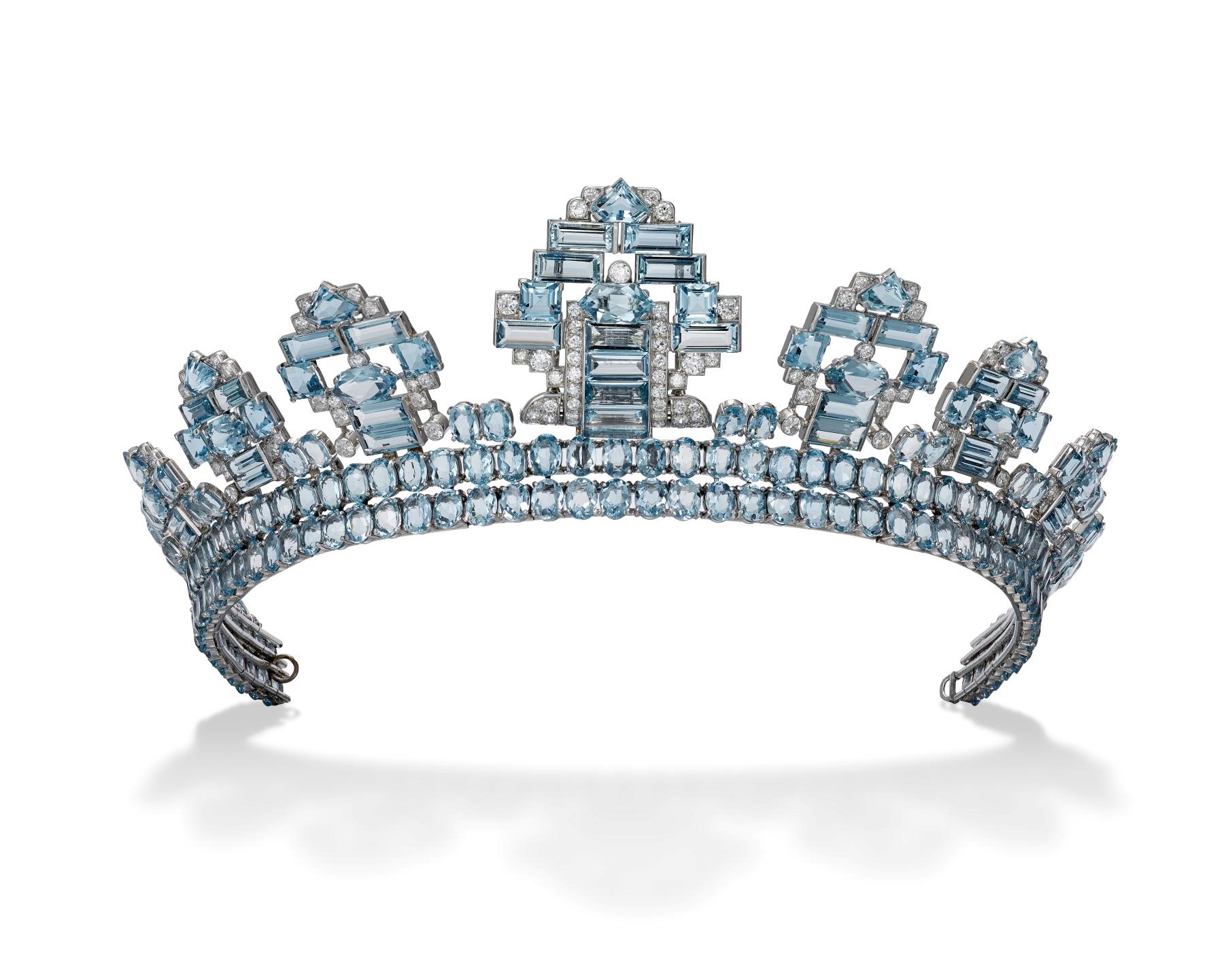
Building on two decades of successful chromatic experiments, Cartier continued to audaciously explore color by reviving the use of so-called “semi-precious” stones in high jewelry starting from the 1930s. Although some appeared in pieces in the 1910s, these fine stones, as they were also known, began to be employed frequently, and the Maison even placed them as the centerpieces of ceremonial jewelry. Two examples are the tiaras created for King George VI’s coronation in 1937, one featuring an aquamarine and the other, a citrine.

Jeanne Toussaint, colour extravaganza
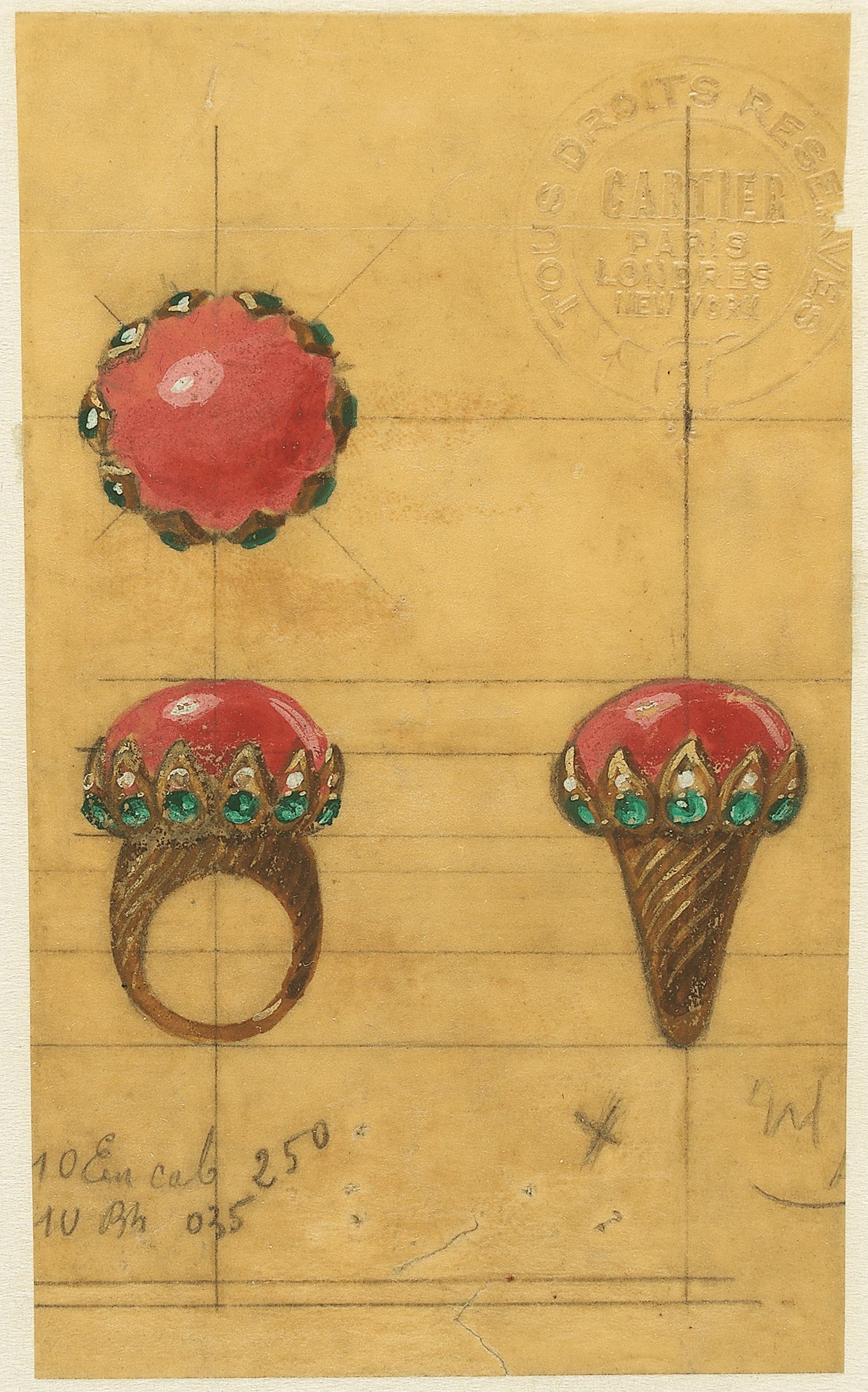
Most of all, it was Jeanne Toussaint, appointed Creative Director in 1933, who dared to mix the gems and mingle them with precious stones. Under her guidance, the Maison considerably enriched its palette. Cartier’s creations explored brand-new contrasts, some of which were particularly unexpected, as described by S. R. Nalys in an article published in L’Officiel de la couture et de la mode de Paris in 1935: “For some, the sense of the new vision of things is so refined that they approach jewelry like a decorative composition, like a 'set' in which colors glitter, summoning the most unexpected contrasts not only of sapphires, emeralds, and turquoise… but still yet that of jade, coral, lapis, crystal, amber and mother-of-pearl.”
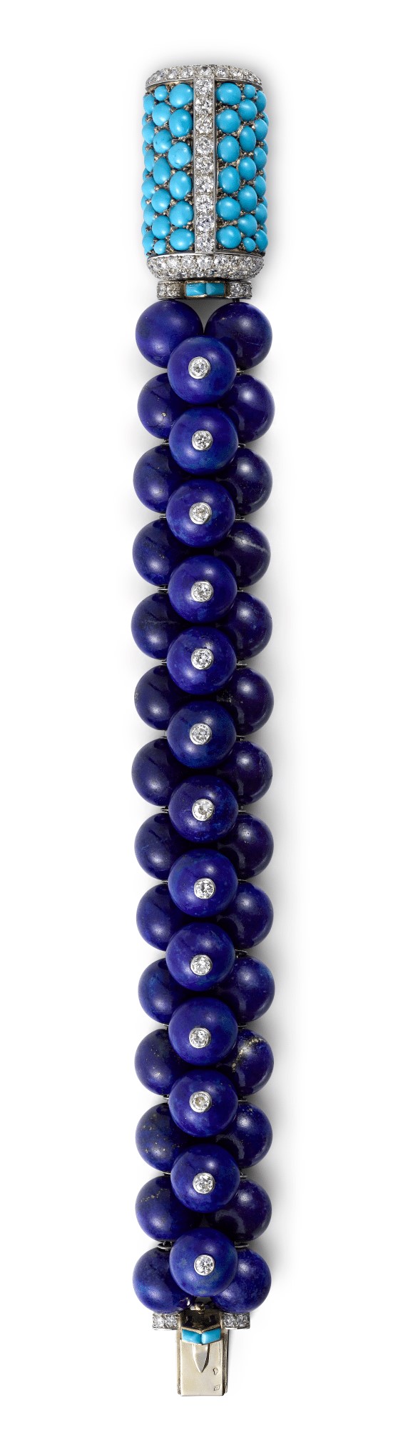
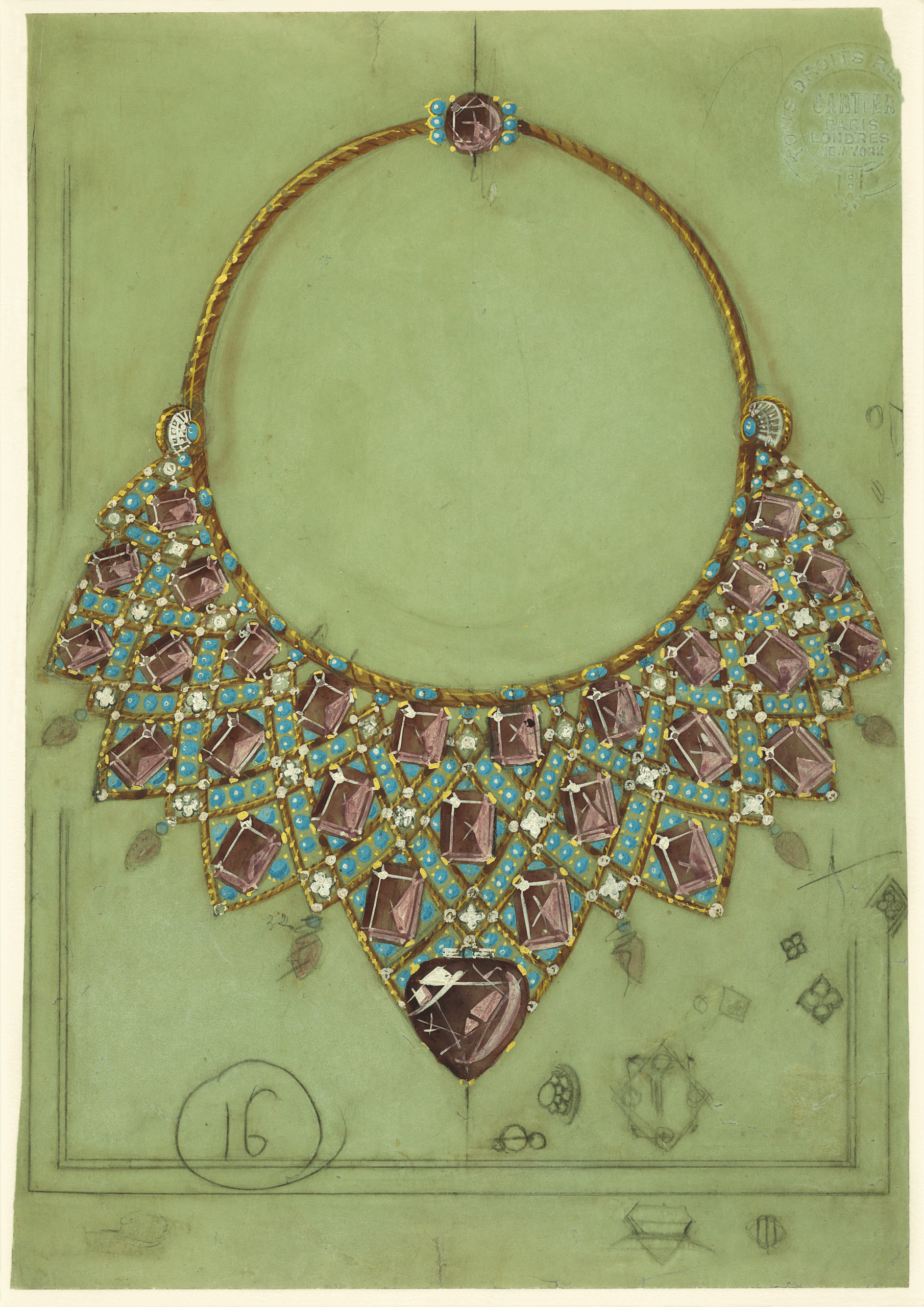
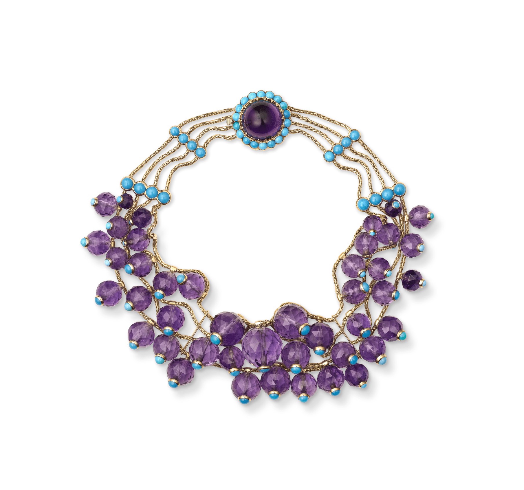
Among the emblematic combinations of the time are lapis lazuli and turquoise, two shades of blue so different that their juxtaposition creates a true contrast. Amethyst was also a favorite stone. Its intense violet nuance was combined with citrin or, again, turquoise, as seen in the necklace commissioned by the Duchess of Windsor in 1947, or the one sold to Daisy Fellowes a few years later, in 1953.
Lastly, Jeanne Toussaint also spurred the revival of yellow gold, probably inspired by Indian jewelry, whose influence Cecil Beaton had observed in his book The Glass of Fashion: “Mademoiselle Toussaint […] creates combinations of colours that before her we had only seen in the jewellery of India.” More than just a setting for the stones, yellow gold was chosen as a color: its sunny tone warmed the contrasts and gave a new twist to even the Maison’s characteristic combinations.
An emblematic palette and new colour COMBINATIONS
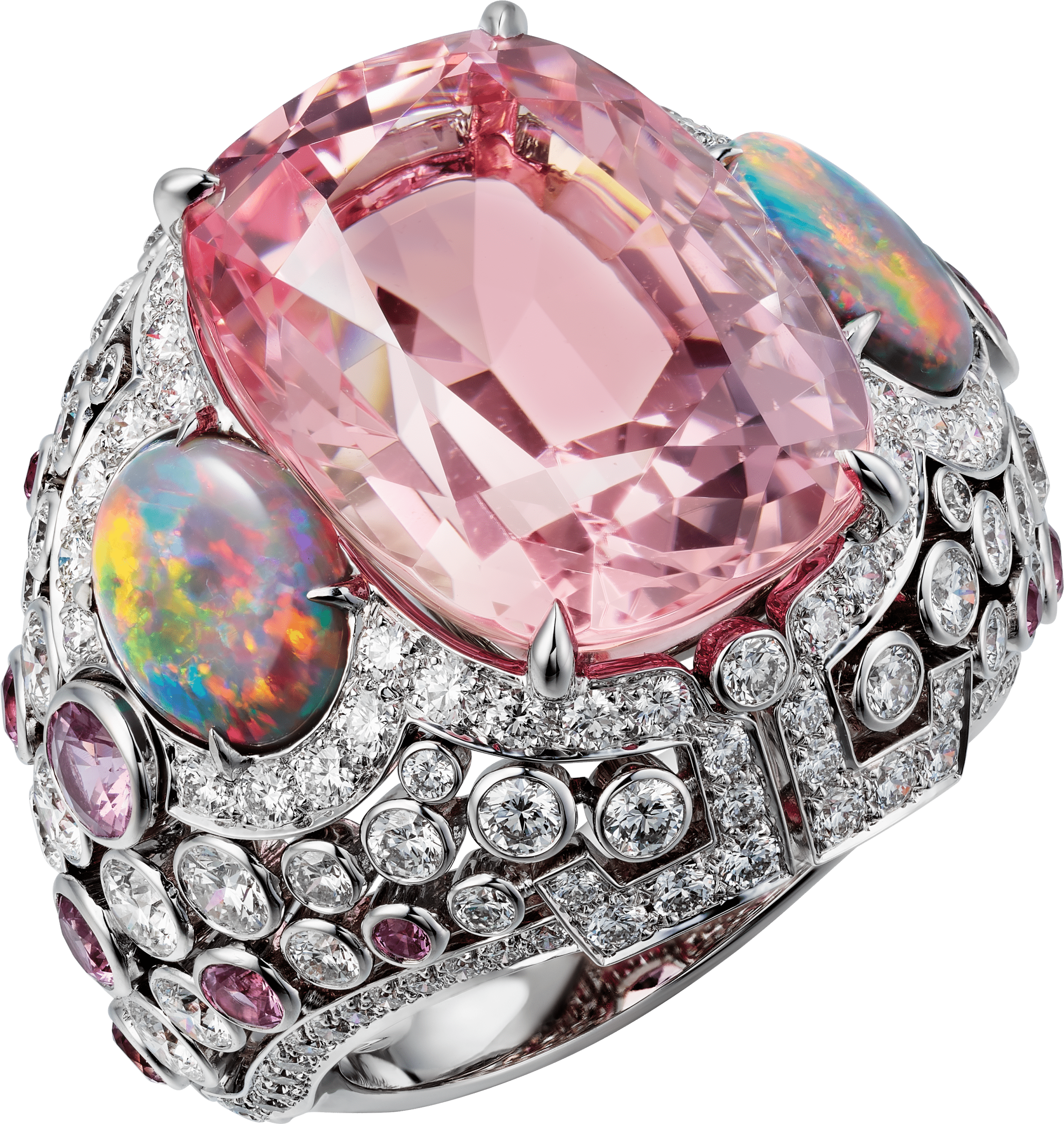
At the end of the 1990s and the beginning of the 2000s, the Maison’s palette introduced more delicate and nuanced new combinations. Shaded camaïeu colors, especially golden brown and saffron hues, made an appearance in Cartier’s repertoire. The jeweler’s chromatic range was also enriched with gentler tints such as pink and mauve pastel and blue and sea green.
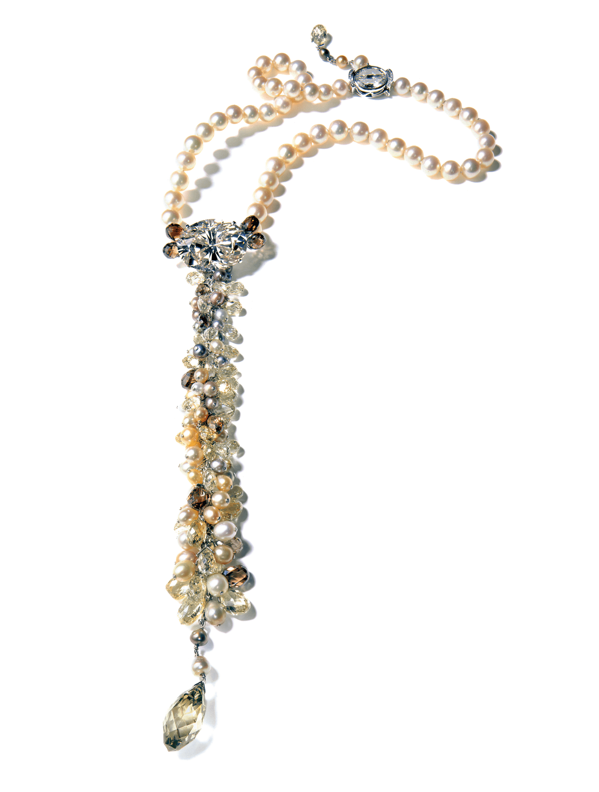
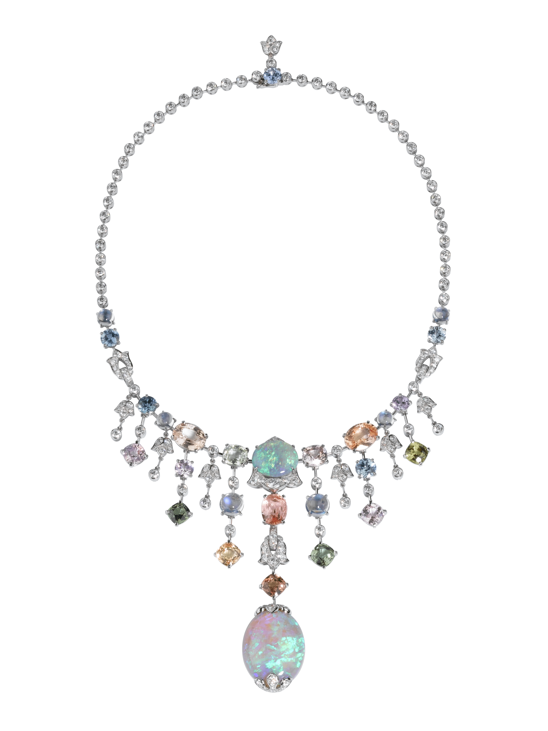

The softer compositions were nevertheless often enhanced with light touches, for example with the vibrant presence of opals. The colorful flashes of opal create an impression of multiple nuances that change in different light. They enliven the design, adding tension rather than straightforward contrast to the composition.
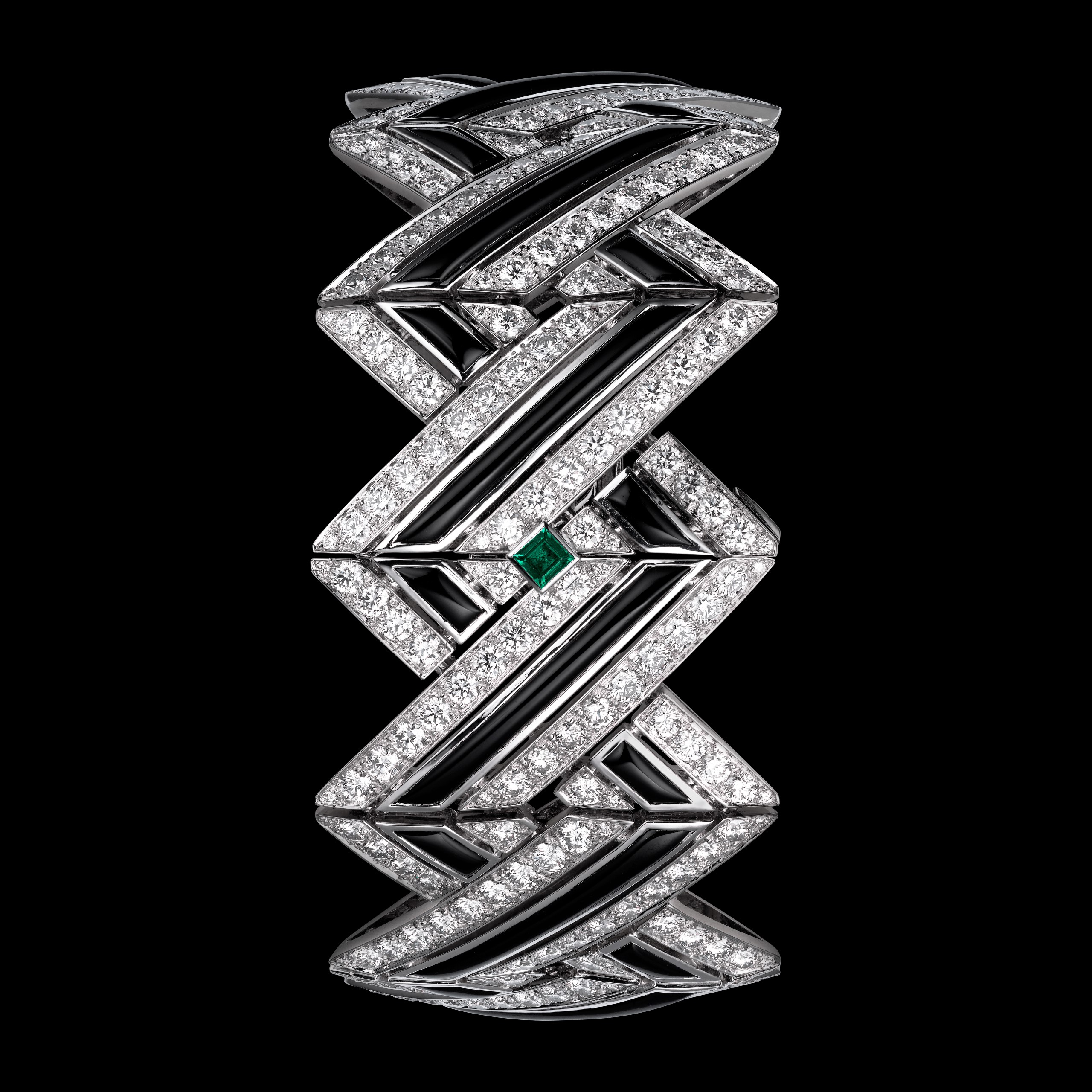
Since the turn of the 2010s, the use of black as punctuation has also reappeared in designs reviving the emblematic contrast of onyx and diamond or emerald with a contemporary approach. Producing a very graphic effect, the black creates a sense of movement. It accentuates the design’s precision, adds tension, forms additional motifs, creates rhythm and even tricks the eye. Borrowing codes from kinetic art, Cartier distinguishes itself from other jewelers by crafting pieces featuring surprising optical effects.
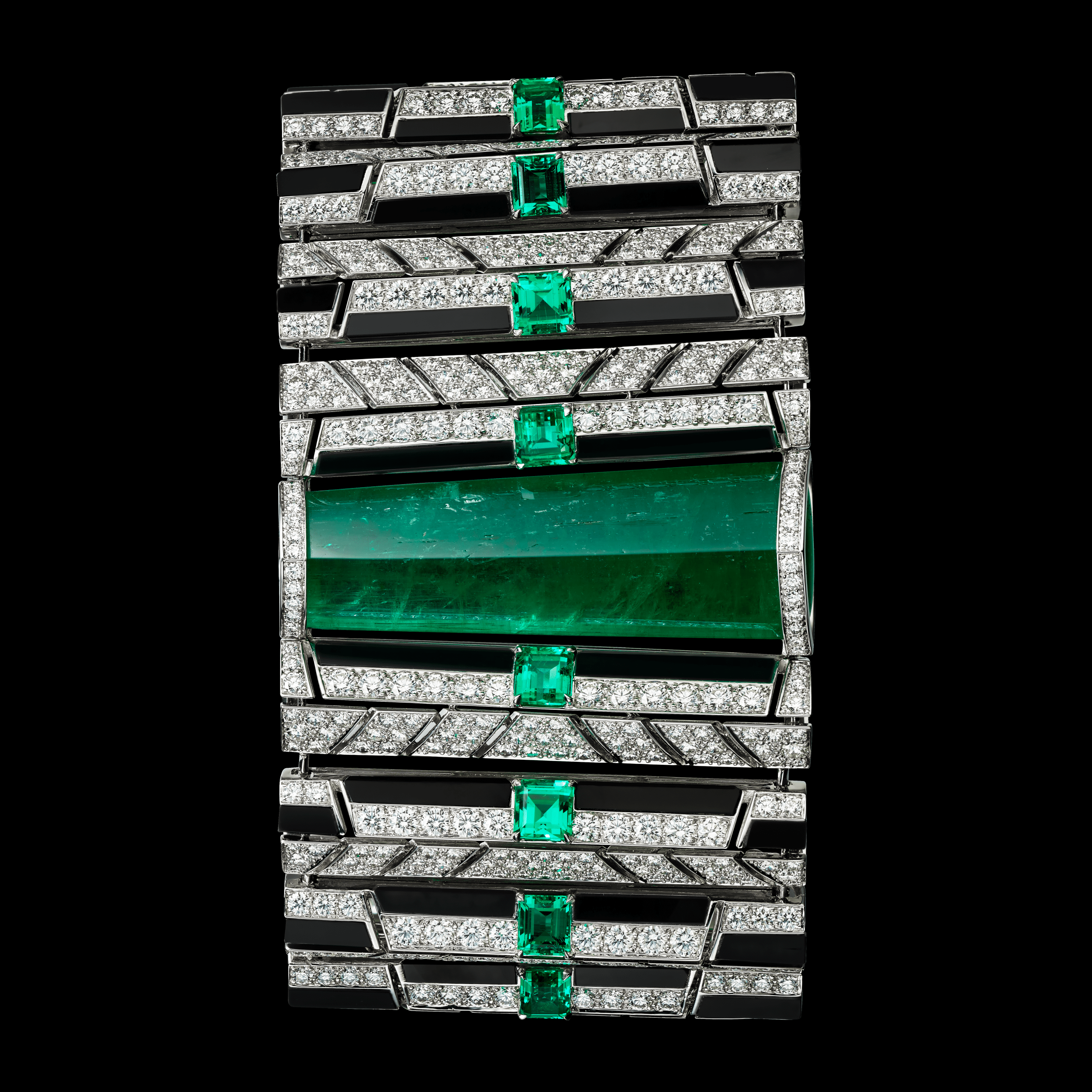
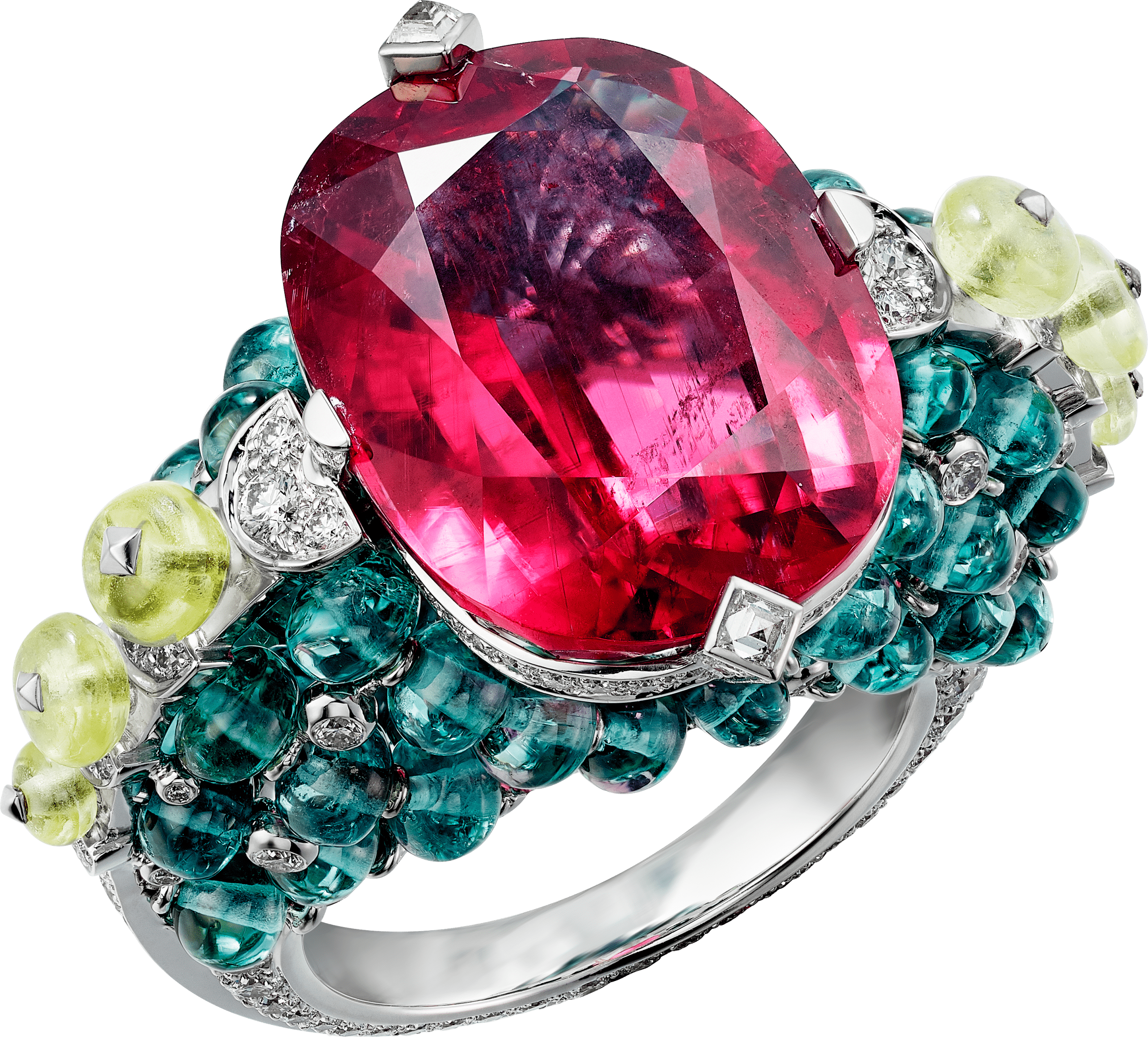
Demonstrating the Maison’s bold creativity, unique materials were used for the first time in jewelry, such as transparent blue skarn employed in 2018. New combinations also emerged, in fresh or more tangy tones. Cartier’s emblematic contrasts also gave rise to new interpretations with the introduction of a wide variety of stones.
The pairing of red and green is embellished with the orangey hue of mandarin garnets and the blue of turquoise, while the red-green-black combination is enhanced by the vibrant color of chrysoprase, and the iconic mix of blue, red and green is reinterpreted in a composition mingling rubellite, blue tourmaline and chrysoberyl.