The jewelry box started life as a straightforward practical accessory, but in Cartier’s hands it has become an object of desire in its own right. Such is the evocative power of this instantly recognizable red box with gold stamping, that it ranks among the Maison’s emblematic style codes.
“I made it through, despite my 105 jewelry boxes. It was a bit risky.” The beginning of a letter from salesman Paul Cheyrouze, traveling to Madrid to do business for the Maison in 1909.
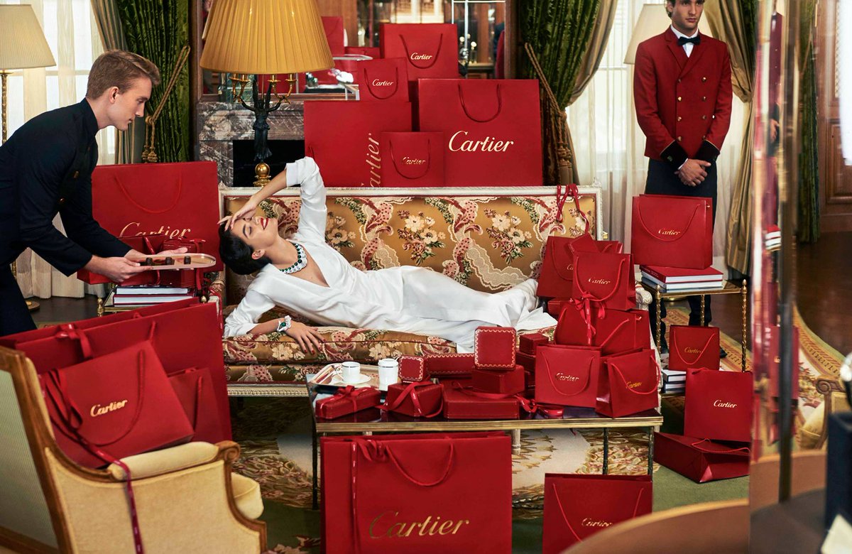
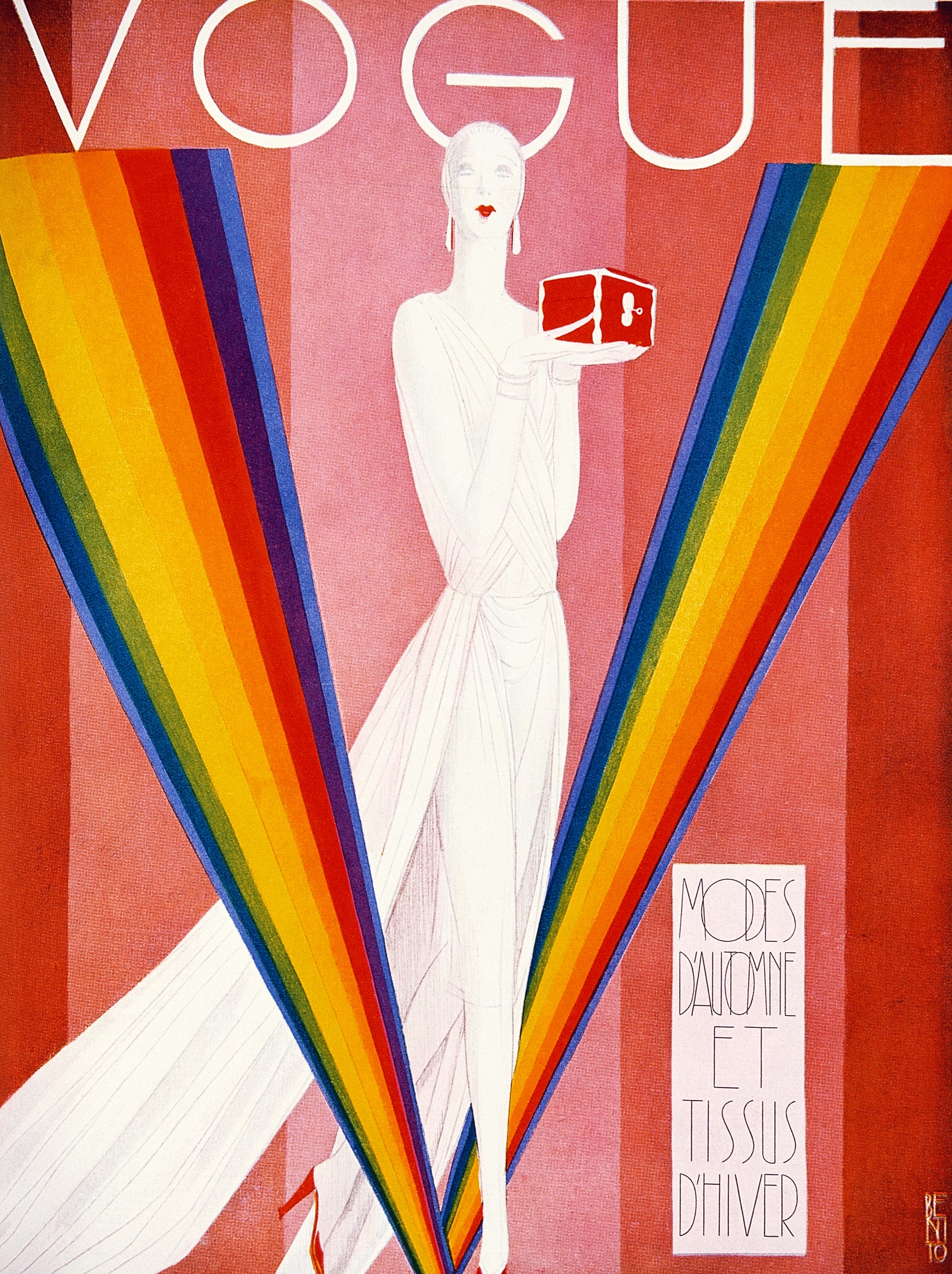
A common object in the realm of jewels, the jewelry box is a channel for sentiment. With a design that has been fine-tuned through the years, Cartier’s jewelry box is so genuinely iconic that it regularly features in the Maison’s publicity campaigns, on the cover or in the editorial pages of prestigious magazines, as well as inspiring the 2018 Guirlande de Cartier leather goods collection.
Characteristics of the Cartier jewelry box
The design of the Maison’s jewelry box went through many iterations before settling into its current red colourway with gold stamping, and its generally square design with canted corners.
The colour
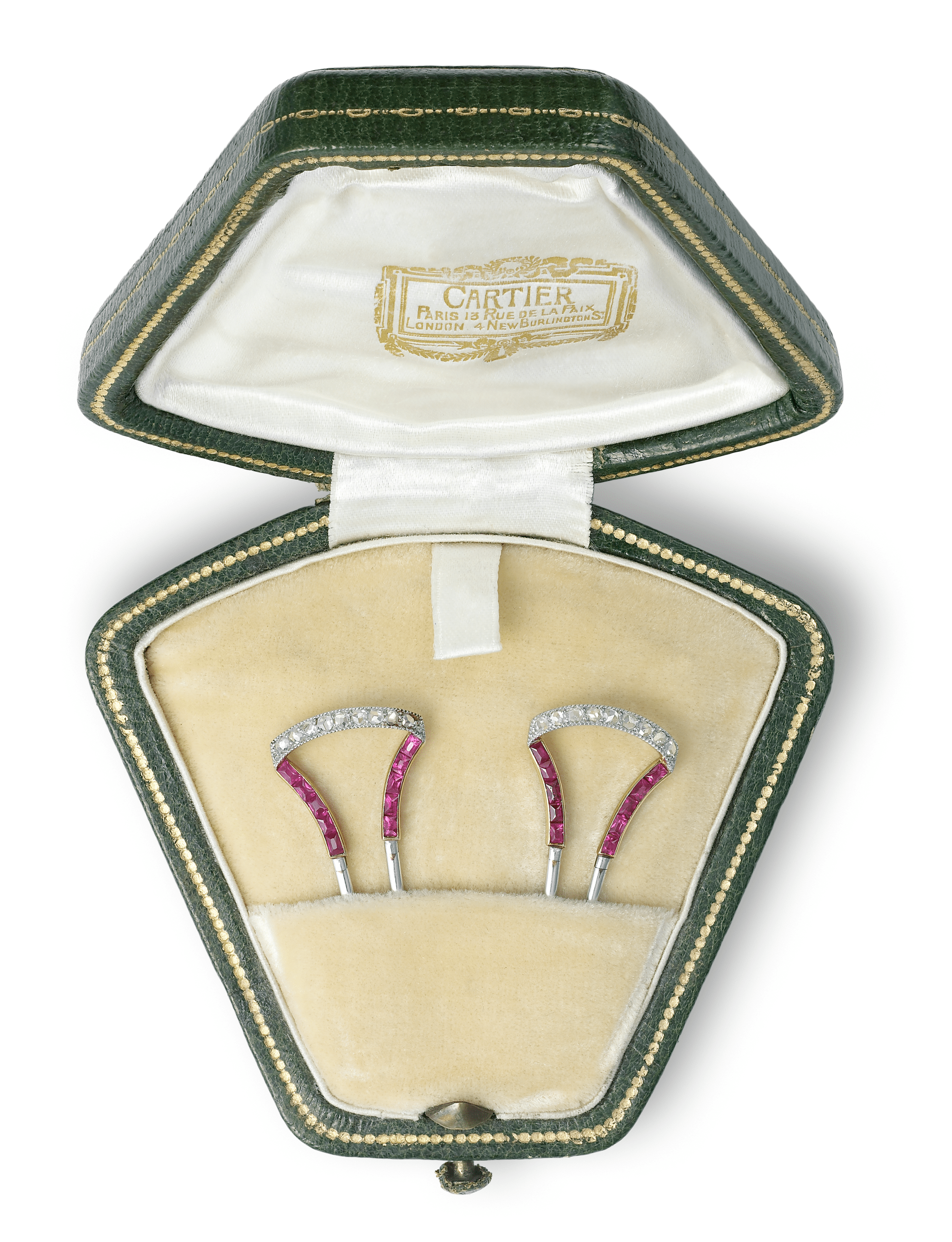
Historically, Cartier’s jewelry box drew on a wide palette of colours, from dark or olive green through multiple shades of red, up to and including old rose, to brown, black and even blue. All these colourways coexisted until gradually red came to dominate, probably between 1920 and 1930, and was elevated to the status of Cartier signature.
The shape
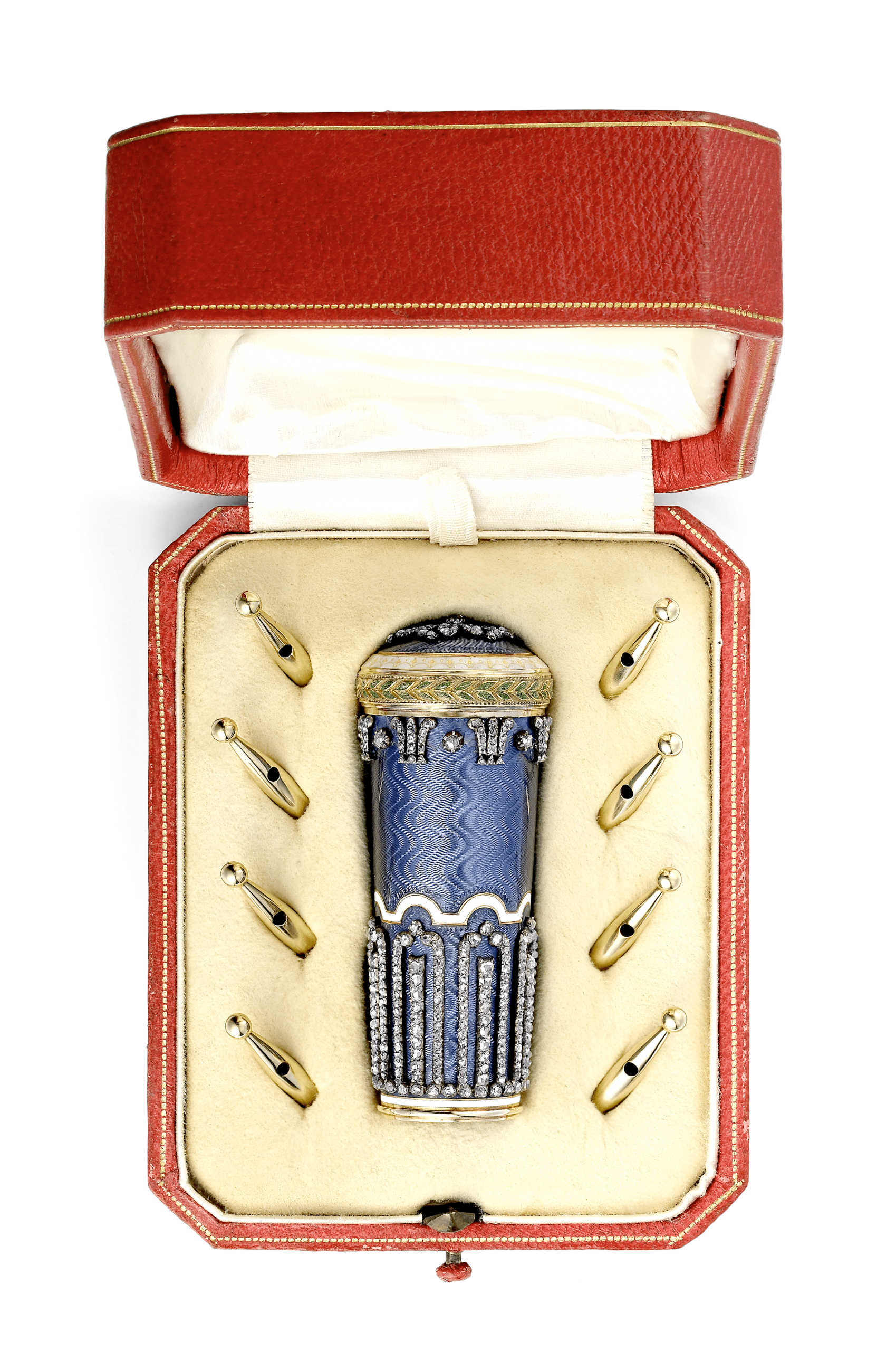
A square with canted corners that is the emblematic shape of a Cartier jewelry box. All the same, the boxes have always come in a very wide range of shapes, given that their dimensions depend on the pieces they contain. Some boxes are custom-made to hold the most exceptional jewels – perhaps a curved box for a tiara, or one with doors for a travel clock.
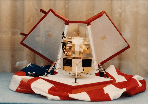
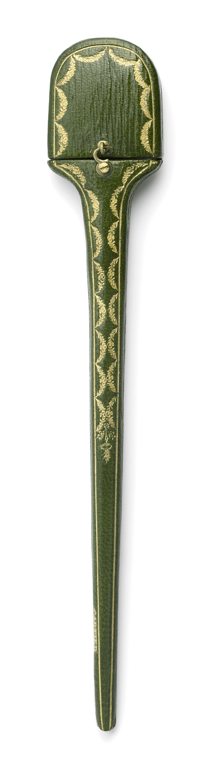
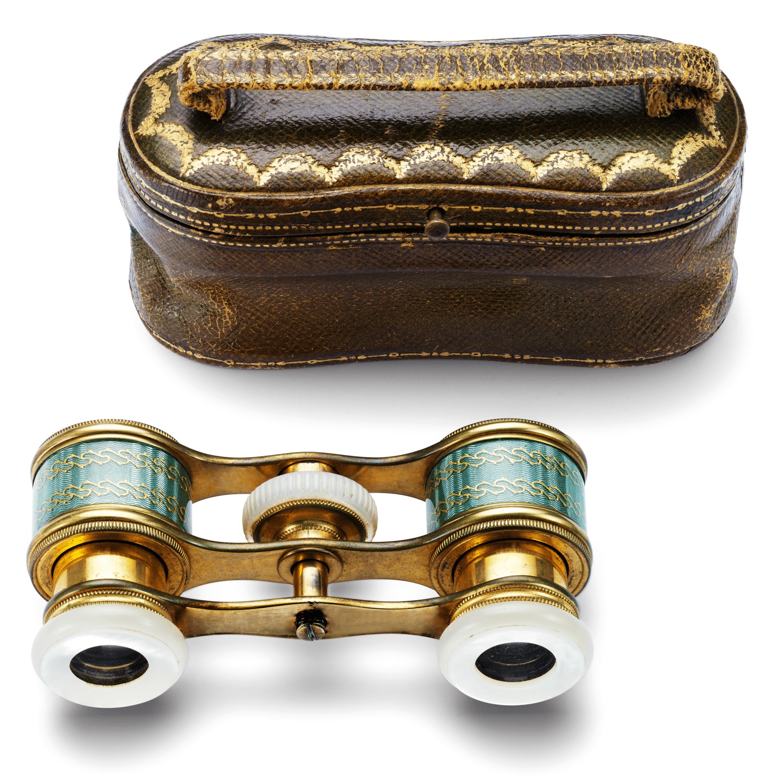
Tightly encasing their contents, the boxes are sometimes surprisingly small – for instance when they hold a tie clip or a hat pin – and can also be simply surprising. Like when they are designed to follow the contours of a cigarette holder, a pair of opera glasses, or even a miniature replica of the lunar module involved in the historic Apollo 11 Moon landing in 1969.
The gold stamping
The Maison’s Archives keep records of the various styles of decorative stamping to have been applied to the boxes. The floral garland frieze that embellishes the top part of today’s boxes first appeared in the early 1900s. Drawing on the aesthetic codes of the 18th century, it reflects Louis Cartier’s taste for the neoclassical style, a penchant that gave rise to the Style Guirlande. This design of repeating arches underwent some variations, but in 1938 it was officially adopted with the more stylized outlines we know today.
Contemporary boxes feature two other types of frieze running around their outer sides: one made up of abstract motifs, the other a fine row of little gold dots that recall precious stitching.
Lining colours
The inside of Cartier’s jewelry boxes was traditionally sheathed in silky fabrics, either white or in shades ranging from beige to cream. Sometimes the lid was lined with a different fabric from the one inside the box section, enabling silk to be combined with velvet, in light colours but also dark ones such as blue, black and brown. A completely black lining has increasingly been used over the last twenty years, and it is now standard in High Jewelry boxes.
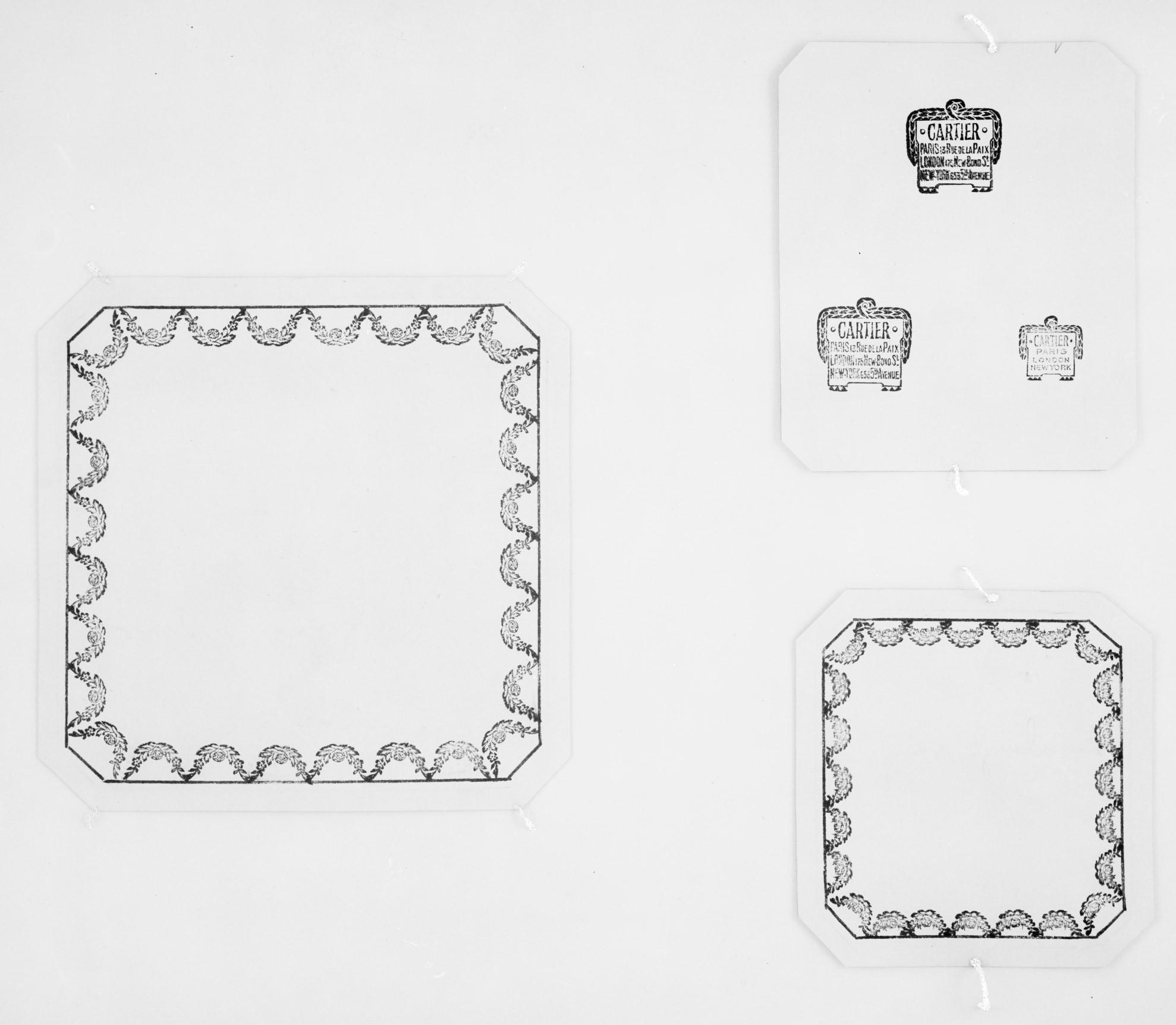
The crest emblem
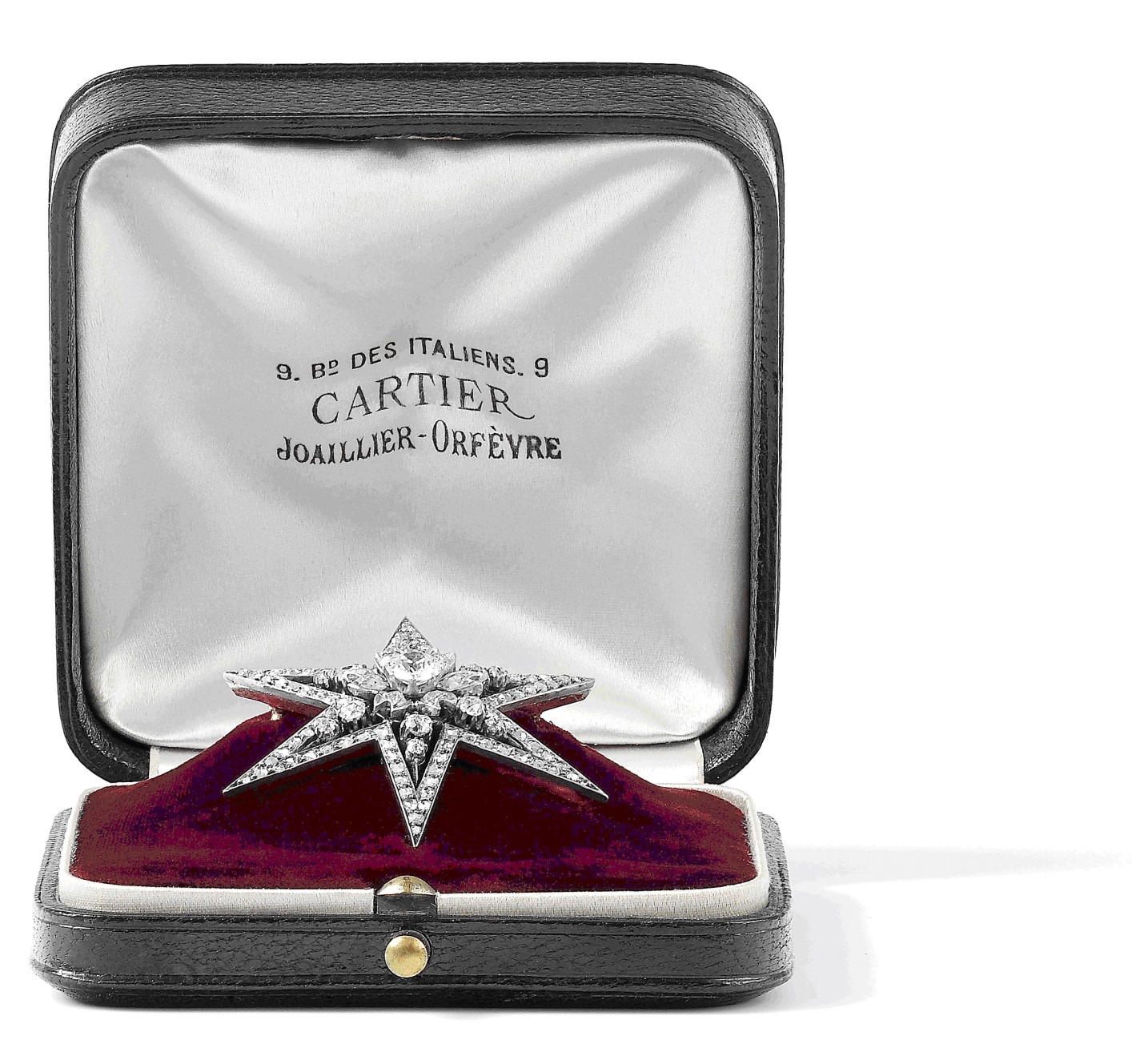
When the box is open, a crest emblem can be seen inside the lid. This emblem has borne witness to Cartier’s different addresses over the course of more than a century. First it stated “9 Bd [boulevard] des Italiens Cartier Joaillier-Orfèvre”, then from 1899 “Cartier Paris Rue de la Paix”. In 1902, “Cartier Paris London” appeared along with the new address. From 1909 on, the New York subsidiary was also shown, with “Cartier Paris London New York” displayed and the address of each boutique listed. More anecdotally, a “Caracas” emblem was discovered on American jewelry boxes that probably dates from the 1950s.
Today’s boxes are marked with either the Cartier logo or the words “Paris London New York” (or “Paris Londres New York” in French). This inscription is a reminder of the Maison’s original anchor points, underscoring the historical dimension of its global standing.
The Cartier jewelry box, a star in its own right
The red colour of a Cartier jewelry box makes a deep impression. As well as symbolizing passionate love in many cultures, it adds a fitting theatricality to the ceremony of giving a precious gift. One is instantly reminded of Elizabeth Taylor, beaming with joy under the sun of Saint-Jean-Cap-Ferrat in the summer of 1957, when her husband Mike Todd gifted her a set of Cartier jewels in their red box. This very cinematic moment was immortalized on film.
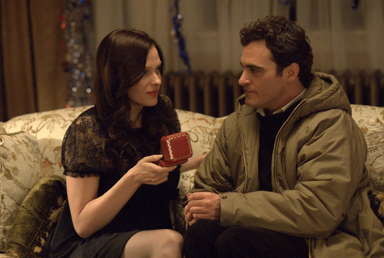
Instantly recognizable, the Cartier jewelry box rapidly become a star in its own right –including on the silver screen. It has accrued several notable acting credits, including Billy Wilder’s Some Like It Hot with Marilyn Monroe and Tony Curtis (1959); How to Steal a Million by William Wyler starring Audrey Hepburn and Peter O’Toole (1966); James Gray’s Two Lovers with Joaquin Phoenix and Gwyneth Paltrow (2008); My King by Maïwenn featuring Emmanuelle Bercot and Vincent Cassel (2015); and Gary Ross’s Ocean’s 8 with Sandra Bullock, Cate Blanchett, Anne Hathaway, Rihanna and Helena Bonham Carter (2018).